

Chapter 2 - Technical Tools
2.1 Candlestick Patterns that you need to know to Trade our System
Candlesticks are graphical representations of price movements over a specific period of time, such as a minute, an hour, a day, or a week. Candlestick patterns, formed by the arrangement of multiple candlesticks, are often used in technical analysis to identify trends, reversals, and trading opportunities.
All charting software available are equipped to present trading data in the form of candlestick charts for technical analysis. We would suggest opening an account with Tradingview (you can start with the free version) as their software is very lucid and user friendly. However, if you already use a different software and are comfortable, please continue with it.
The anatomy of a candlestick consists of several components that provide valuable information about price action during a specific time period. Here's a breakdown of the key parts of a candlestick:

Fig 1.0 - Anatomy of a candle
-
Real Body: The body of the candlestick represents the range between the open and close prices during the given time period. If the closing price is higher than the opening price, the body is coloured green or white to represent bullishness. Conversely, if the closing price is lower than the opening price, the body is coloured red or black to represent bearishness.
-
Wicks (or Shadows): The wicks, also known as shadows, extend above and below the body of the candlestick and represent the highest and lowest prices reached during the time period. The length of the wicks relative to the body can provide insights into the volatility and price movement during the period. Longer wicks indicate greater price volatility, while shorter wicks suggest more stability.
-
Open Price: The open price is the first price at which the asset traded during the time period represented by the candlestick. It is represented by the lower point of the body if the candle is bullish or by the top of the body if the candle is bearish.
-
Close Price: The close price is the last price at which the asset traded during the time period represented by the candlestick. It is represented by the ending point of the body if the candle is bullish or by the bottom of the body if the candle is bearish.
The candlestick patterns that you need to know to follow our Trading System is limited to only a few basic patterns out of an universe of tens of patterns with exotic names! This limited number is integral to our setups and is covered in the following content. Throughout this course, we have consciously attempted to cut through the clutter to only include what works, and this is an example of that.
Important Candlestick Patterns:-

The above are the basic candlestick patterns, mostly signifying reversal. Other patterns (with exotic names) are essentially a variation/combination of these basic patterns.
a) Big Green or Big Red Candle
A Big Green or Big Red Candle is characterized by a single candlestick with a relatively large body indicating a strong bullish or bearish momentum in the market respectively.

Fig 1.1 - Big Green and Big Red
Key characteristics include:
-
Large Body: The body of the candlestick is notably large, indicating a significant price movement during the given time period. The size of the body suggests strong buying (for Green) or selling (for Red) pressure throughout the period.
-
Minimal or Absent Upper and Lower Wick: In a Big Green Candle, the upper wick (or shadow) is either very small or completely absent, indicating that the price closed at or near the high. Similarly, the lower wick (or shadow) is also very small or non-existent, suggesting that the low for the period was at or near the open. Vice versa for Big Red.
A Big Green Candle is a bullish signal, suggesting strong buying interest and potential continuation of the upward trend. It often occurs after a period of consolidation or a pullback in price, indicating a resurgence of bullish momentum.
Vice versa of above for Big Red pattern.
b) Hammer or Reverse Hammer
A Hammer is a single candlestick pattern that forms at the bottom of a downtrend and signifies a potential reversal in the price action. It has a small body at the top with a long lower shadow, resembling a hammer, hence the name. Vice Versa for Reverse Hammer (aka Shooting Star).

Fig 1.2 - Hammer and Reverse Hammer
The Hammer pattern indicates that despite the sellers' dominance during the trading session, they lost control at some point and the buyers were able to push the price back up. This would mean that a reversal to the upside may be imminent resulting from a shift in momentum from bearish to bullish.
Longer the lower shadow, stronger the Hammer.
A Hammer forming at support offers additional confirmation and makes the pattern stronger.
Vice versa of above for Reverse Hammer.
c) Bullish or Bearish Engulfing
A Bullish Engulfing pattern after a significant downtrend consists of two candlesticks having the following characteristics:
-
The first candlestick is bearish, representing the continuation of the downtrend.
-
The second candlestick is bullish and completely engulfs the body of the first candlestick. The closing price of this candlestick should be higher than the opening price of the first candlestick. The larger the engulfing candle, the more significant the pattern.

Fig 1.3 - Bullish and Bearish Engulfing
The Bullish Engulfing pattern indicates a potential reversal from a downtrend to an uptrend. It suggests that buyers have overwhelmed sellers, leading to a shift in momentum, as evidenced by the second candlestick completely engulfing the first one.
Like other reversal patterns, a Bullish Engulfing pattern is more significant when it forms near key support levels.
Vice versa of above for Bearish Engulfing.
d) Piercing Pattern or Dark Cloud Cover
The Piercing Pattern is a two candlestick pattern that occurs after a significant downtrend, and signals a potential reversal to an uptrend.
-
The first candlestick is a bearish candlestick, indicating continued selling pressure.
-
The second candlestick is a bullish candlestick that opens with a gap down below the previous day's low but closes more than halfway into the body of the previous day's bearish candlestick.

Fig 1.4 - Piercing Pattern and Dark Cloud Cover
Piercing Pattern suggests that the buyers have found value at the price level that opens with a gap down after a sustained downtrend, indicating a potential reversal from a downtrend to an uptrend.
The pattern becomes more significant when it forms near support levels or after a prolonged downtrend.
Vice versa of above for Dark Cloud Cover.
e) Doji
A Doji is a candlestick pattern that indicates indecision or a standoff between buyers and sellers. It forms when the opening and closing prices are very close to each other, resulting in a candlestick with a very small body and often long upper and lower shadows. The shape of a Doji resembles a cross or plus sign.

Fig 1.5 - Doji
The interpretation of a Doji depends on its context within the price action:
-
In an uptrend or downtrend, a Doji may signal potential exhaustion of the trend and a possible reversal, especially if it occurs after a series of bullish or bearish candles respectively. If the subsequent candle is a strong candle in the other direction, then there is a high chance that the trend might have reversed.
-
In a sideways or range-bound market, a Doji or a series of Dojis suggest continued indecision and lack of a clear direction.
The pattern becomes more significant when it forms at or near support or resistance levels after a prolonged trending move and at reasonable higher volume than the preceding candles.
Types of Dojis : There are several types of Dojis that are commonly known as Long Legged Doji, Dragonfly Doji and Gravestone Doji. They differ in the position of the real body relative to the upper and lower wick. Typically, they have a bigger range than a standard, neutral Doji and are more likely to cause a trend reversal if they occur after a significant trend.

Fig 1.6 - Different Types of Dojis
A Long Legged Doji has long upper and lower wicks with the real body almost in the middle of the range. It signifies a fierce battle between bulls and bears and is more likely to cause a trend reversal particularly if it happens at a higher volume after a significant uptrend or downtrend.
A Dragonfly and a Gravestone Doji resemble a strong hammer and a reverse hammer respectively with a very small real body. If they occur after a prolonged trend, they are very likely to result in a trend reversal because they signify exhaustion of the existing trend and shift of momentum.
f) Narrow Range including Bullish or Bearish Harami
Narrow Range (NR) is a candlestick pattern characterized by a relatively small price range between the high and low prices compared to previous candlesticks. It suggests a contraction in price volatility and indecision in the market. It indicates that neither buyers nor sellers have gained significant control over the price direction during the trading period.

Fig 1.7 - Narrow Range, Inside Bar and Harami
It becomes an Inside Bar if it is completely engulfed by the trading range of the previous candlestick. It can form anywhere within a series of candles, whether there is a trend or the price action is sideways. If it forms within a sideways market, it does not have much meaning. However, if it forms within a trend preceded by a large candlestick in the opposite color, it is known as a Harami and suggests a potential reversal, particularly if it forms near strong S/R levels.
For example, a Bullish Harami occurs when the candlestick is a NR green candlestick and is contained within the lower half of the previous long red candlestick in a downtrend. It suggests a shift in momentum on the downside leading to a potential reversal from a downtrend to an uptrend. Vice versa for Bearish Harami.
Though a Narrow Range candle in itself does not have much meaning, but a series of such bars signifies reducing volatility and the market reaching a stage of equilibrium. Normally, the market does not stay in equilibrium for long and makes a big move once the equilibrium phase is over. So you should expect a big move after a series of Narrow Range candles, particularly if they occur near a breakout or breakdown level.
For example, if you find NR candles very close to the neckline of a large H&S pattern a breakout may be imminent. Another example is when a series of NR candles form in combination with Dojis after a good trending move, you should expect a meaningful reversal.
With this, we have covered the candlestick patterns that are relevant to our Trading System.
2.2 Chart Patterns that you need to know to Trade our System
As with candlestick patterns, what you need to know are basic chart patterns that would be relevant to our System, not the umpteen that fill up pages and pages of books and manuals on technical trading.
These basic chart patterns are integral to understanding the charting landscape and hence the prevailing market mood. Eventually, the application of this knowledge plays a significant role in trade selection, critical to your trading success.
Important chart patterns

In the subsequent posts, we provide a brief explanation of the above patterns along with a snapshot of the chart formation from Trading View charting software of the 2H or 4H chart. These patterns are valid for any timeframe whether intraday, daily or weekly.
When we talk about setups, we would present number of examples from charts with practical application of the psychology behind these patterns. Please do not bother about understanding technical targets and stop losses for now as that would be very specific to the setups.
a) Head & Shoulders or Reverse Head and Shoulders
The Head & Shoulders (H&S) pattern is a popular and widely recognized chart pattern used in technical analysis to identify potential trend reversals. It typically signals the end of an uptrend and the beginning of a new downtrend. The pattern consists of three peaks, with the middle peak (the "Head") being higher than the other two peaks (the "Shoulders").

Fig 1.8 - Head & Shoulder
Here's how the H&S pattern forms and what it signifies:
-
Left Shoulder: The pattern begins with an uptrend, represented by a peak (shoulder) followed by a pullback and a subsequent rally to a higher peak (the head).
-
Head: After the first peak, the price retraces before rallying to form a higher peak, known as the head of the pattern. The head is usually the highest point in the pattern.
-
Right Shoulder: Following the head, there's another pullback in price, followed by a final rally attempt that fails to surpass the high of the head. This creates a third peak, which is lower than the head and often similar in height to the left shoulder.
-
Neckline: The neckline is a trendline drawn through the lows of the pullbacks between the peaks. It serves as a support level for the price. Once the price breaks below the neckline, it confirms the completion of the pattern and signals a potential trend reversal.
The H&S pattern is considered complete when the price breaks below the neckline after forming the right shoulder. Traders often use this breakout as a signal to initiate short positions or to exit long positions, anticipating further downward movement in price.
It's important to note that while the Head and Shoulders pattern is widely recognized, it's not always perfectly symmetrical, and variations in its structure can occur.
Additionally, like any technical analysis tool, false signals can occur, called as pattern failure. A pattern failure on the H&S can occur in many ways like the price after breaking below the neckline reverses and closes above the right shoulder. Or a small bullish pattern forms right after the breach of the neckline and a subsequent bullish breakout happens.
A pattern failure can be very strong as it traps the bears who may be forced to exit their bearish bets as the price starts moving in the opposite direction. We will share examples when we discuss our setups to show how this happens and how to capitalize on it. In fact, our Trading System is geared to take advantage of pattern failures.
Reverse Head & Shoulder is a bullish pattern, the exact reverse of H&S above.

Fig 1.9 - Reverse Head & Shoulder
b) Double Top or Double Bottom
A Double Top is a common chart pattern that indicates a potential trend reversal from bullish to bearish. It occurs after an uptrend and consists of two consecutive peaks that reach a similar (more or less) price level, separated by a trough (a pullback).

Fig 2.0 - Double Top
Here's how the Double Top pattern forms and what it signifies:
-
Initial Top: The price of the asset reaches a high point, forming the first peak.
-
Trough: After the first peak, the price retraces or pulls back from the high but finds support at a certain level, forming a trough or valley.
-
Second Top: The price rallies again to near the level of the initial peak, forming the second peak. This peak is often similar in height to the first peak, however, it may slightly exceed or fall short of the first peak.
The formation of two peaks at approximately the same price level suggests that the upward momentum is weakening, and the market may be running out of buyers willing to push the price higher. It is a bearish pattern, indicating a potential reversal of the uptrend and a possible downtrend ahead. The confirmation of the pattern usually occurs when the price breaks below the trough or the neckline that separates the two peaks.
Similar to H&S, a pattern failure on the Double Top can occur in many ways like the price after breaking below the neckline reverses and closes above the neckline. Or a small bullish pattern forms right after the breach of the neckline and a subsequent breakout happens.
Double Bottom is a bullish pattern, the exact reverse of Double Top above.

Fig 2.2 - Double Bottom
c) 1-2-3 Top or 1-2-3 Bottom
A 1-2-3 Top occurs frequently on the charts, sometimes as part of a larger pattern, usually after a significant uptrend. It indicates the end of the uptrend and a potential reversal to a downtrend. It is similar to a Double Top in appearance except for the fact that the second top (point 3) is lower than the first top (point 1).

Fig 2.3 - 1-2-3 Top
The formation of the second peak at a lower level than the first resembles the Head and the Right Shoulder pattern in the H&S, and is weaker than the Double Top. The pattern occurring after a sustained uptrend is a strong signal for the trend to reverse. The confirmation of the pattern usually occurs when the price breaks below the trough or the neckline that separates the two peaks.
Similar to H&S, a pattern failure on the 1-2-3 Top can occur in many ways like the price after breaking below the neckline reverses and closes above the neckline. Or a small bullish pattern forms right after the breach of the neckline and a subsequent breakout happens.
1-2-3 Bottom is a bullish pattern, the exact reverse of 1-2-3 Top above.

Fig 2.4 - 1-2-3 Bottom
d) W Pattern
The W pattern resembles the letter "W" and is considered a bullish reversal pattern. It typically occurs after a prolonged downtrend and signals a potential change in trend direction from bearish to bullish. It is basically a Double Bottom pattern, however, the difference is that it is larger, more pronounced and forms over many days if we are looking at 2H charts. Hence, any breakout from this pattern is stronger and more reliable.

Fig 2.5 - W Pattern
The reverse of this pattern, the M Pattern occurs very infrequently on the charts at the top and hence, not covered. It is because by its very nature, price action spends a longer time at market lows than at the top, where the price action is more likely to form other reversal patterns like a H&S, Double Top or a 1-2-3 Top.
e) Flag or Pennant
A Flag or a Pennant forms during sideways consolidation, a continuation pattern that typically occurs after a strong price movement, either upwards (bullish) or downwards (bearish).

Fig 2.6 - Flag and Pennant
The Flag Pattern resembles a rectangular shape that slopes against the preceding trend. It consists of price action contained between two parallel trend lines representing the upper and lower boundaries, usually close to each other.
The Flag Pattern forms as a brief consolidation phase, a short term pattern, following a sharp price movement. The breakout from a Flag Pattern usually occurs in the direction of the preceding trend. However, it may also break in the opposite direction signalling a reversal. Usually, a breakout following a short consolidation is more reliable. The longer the sideways consolidation, higher the chances of false breakouts and/or a reversal.
The Pennant Pattern is similar to a flag but has converging trend lines instead of parallel lines. It typically forms a small symmetrical triangle shape.
f) Sideways Rectangle or Trading Range
A Sideways Rectangle, also known as a Trading Range or consolidation pattern, represents a period when the price moves within a range, forming horizontal support and resistance levels. As the market is sideways for most of the time, this pattern occurs very frequently. It represents equilibrium in the market, where buying and selling pressures are roughly equal.

Fig 2.7 - Rectangle or Trading Range
The sideways Rectangle pattern is characterized by parallel horizontal lines that represent the upper and lower boundaries of the trading range. These lines connect multiple highs and lows within a period of consolidation. You can expect to find multiple candlestick and chart patterns within this range that have little or no significance unless they form at or very close to the upper or lower boundary signaling a reversal. In the above example, you can see many examples of Bullish and Bearish Engulfing, Hammer and Reverse Hammer forming at or very close to the lower and upper boundaries respectively, resulting in a strong reversal.
The duration of a sideways Rectangle Pattern can vary widely, ranging from several hours to several days to several weeks, depending on the timeframe being analyzed and the underlying market conditions. Eventually, the price typically breaks out of the trading range, either to the upside or the downside.
The breakouts are characterized by multiple false ones, wherein the price appears to breaching either boundary only to revert to the range after a brief while. As mentioned before in the case of pattern failures, these false breakouts operate as traps and can move in the other direction very quickly.
2.3 Introduction to Support and Resistance
Support and Resistance (S&R) are foundational concepts in technical analysis used to identify key levels where the price of an asset is likely to encounter obstacles in its movement.
Support is a price level where the price action finds it difficult to break below, as there is typically a concentration of buying interest at or around that level. When the price approaches a support level, buyers are more inclined to enter the market, leading to increased demand and a potential reversal of the downtrend or a temporary halt in the downward movement.
Support levels can be identified by looking at historical price data and identifying areas where the price has bounced back from after declining. They can also be associated with psychological levels, moving averages, trendlines, or chart patterns.
Resistance levels are exactly opposite of support levels.

Recognition of strong S&R levels is key to make informed trading decisions. You buy near support levels with the expectation of a bounce, or sell near resistance levels with the anticipation of a reversal. A breakout above resistance is potentially bullish and a breakdown below support is potentially bearish price action. A strong support level changes to resistance on breach and vice versa.
When defined setups appear on the chart, their proximity to S&R levels is integral to filtering the trade. For example, a bullish setup appearing at or just below a strong resistance level can be filtered out as the probability of price advance is low. On the other hand, a bullish setup occurring
-
at a strong support level or
-
when the price has already broken above nearby resistance level (which then becomes support)
has a much higher probability of advancing.
S&R can be classified into four types as below, each having its own characteristics.
-
Horizontal
-
Pivot
-
Congestion
-
Gap
Each of these different types has been detailed along with chart examples in the following explanations. Each of the chart examples has detailed annotations that explain the charting landscape and the topic of discussion.
There are many other types of S&R that are followed by the trading community such as those denoted by trendlines or moving averages, however, this tutorial is only about content relevant to our Trading System.
a) Horizontal Support and Resistance
A Horizontal S/R line is a straight, flat line drawn on a price chart at a specific price level where the market has historically repeatedly reversed, paused, or consolidated — reflecting a significant zone of buying or selling activity.
Support Line is a horizontal level where price tends to stop falling and bounce back up. Resistance Line is a horizontal level where price tends to stop rising and reverse downward.
How to Identify One
You draw a horizontal line by connecting two or more price points (highs or lows) at the same price level, where the market has:
-
Bounced multiple times
-
Formed wicks/shadows repeatedly
-
Consolidated or stalled
The more times price has tested and respected a level, the stronger that level is.
Role Reversal
When price breaks through a support or resistance level with conviction:
-
Support → becomes Resistance (old floor becomes new ceiling)
-
Resistance → becomes Support (old ceiling becomes new floor)
This is called a polarity flip and is one of the most reliable concepts in technical analysis.

Fig 2.8 - Horizontal S&R
For a comprehensive view:
Intraday - Use a 4-hour/ 2-hour (4H/2H) time-frame depending on number of candles that are involved
Positional - Use a daily (D) time-frame. Use weekly(W) for the bigger picture.
This method is straightforward yet highly effective. When price action approaches a horizontal S&R line, there is a high likelihood of a reversal. Strong reversal patterns such as Hammer, Reverse Hammer, Bullish Engulfing, Bearish Engulfing, Double Bottom, or Double Top, forming near these horizontal lines, provide significant confirmation signals.
Understanding and applying Horizontal S&R can greatly enhance your trading strategy by identifying potential reversal points and making more informed decisions.
EXAMPLES
The examples provided below and in the following sections are drawn from both CFD and Futures charts of various indices, commodities and crypto to give you a varied flavor. Note that it does not matter whether the chart example is drawn from a CFD or Futures product as the price action remains more or less the same, with all technical tools equally applicable.
Intraday

Fig 2.9 - 4H chart of Gold Futures - Horizontal S/R depicts numerous reversal points that form at or near the horizontal. Eventually support level B breaks to generate a strong downward trend that runs up to the next support level C.

Fig 2.10 - 2H chart of Crude CFD - Horizontal R forms after joining 2 reversal points almost at the same level. Subsequently, price approaches R again and forms a Bearish Engulfing forms right at the R, a strong confirmation of the sell signal.

Fig 2.11 - 4H chart of Bitcoin Futures - Horizontal channel forms over 2 months. Price breaks out from the upper boundary R but fails to advance, a buy failure that drops all the way to the lower boundary S of the channel. The subsequent breach of the lower boundary results in a steep decline.
Daily

Fig 2.12 - Daily chart of Crude CFDs - A horizontal range forms over 2 months. The first breach of the lower boundary S proves to be false but the second breakdown is comprehensive. This is typical of strong S/R where the first breach is often false.

Fig 2.13 - Daily chart of DJIA Futures - S/R levels that form naturally as price moves up and down. Once these levels form, pay close attention to any reversal patterns forming at or near these levels for a trade with high conviction.
b) Pivot Support and Resistance
A single sharp turning point, known as a Pivot, that formed a short-term high or low after a reasonable advance or decline, serves as strong resistance or support when price action approaches it again. Ensure that the price travels far enough after forming a pivot before approaching again i.e. the price action does not happen in a narrow range or congestion. The retest usually happens in 1-5 days on the intraday chart but may also happen the same day. The interval may be longer for a daily chart.

Fig 2.14 - Pivot S&R
Key Points:
-
Pivot S/R: Pivot S/R is generally shorter-term compared to Horizontal S/R.
-
Reversal Patterns: Any reversal candlestick pattern near the pivot strongly confirms a reversal.
-
Double Bottom/Top: A pivot support or resistance, when confirmed by a reversal, forms a Double Bottom or Double Top (refer to Chart Patterns).
-
Horizontal S/R: Two pivot points at the same level can be connected and extended to form a horizontal S/R.
EXAMPLES
Intraday

Fig 2.15 - 2H chart of Crude CFDs - Price forms a hammer slightly above the Pivot S formed a day earlier. After 7 days, a Reverse Hammer forms with a slight breach of the prior Pivot R that formed earlier in the day. The former reversal forms a Double Bottom and the latter a Double Top.

Fig 2.16 - 1H chart of BTC CFDs - Price forms a Double Top close to prior Pivot R and reverses sharply to breach the bottom Horizontal S. Whenever price approaches a prior Pivot S or R, be alert to the likelihood of a reversal.

Fig 2.17 - 4H chart of S&P Futures - A strong uptrend in S&P that overcomes resistance at prior Pivot R’s on four occasions. When the price closes strongly above (below) the Pivot R (S), it either indicates the start of a new trend or continuation of prior trend.
Daily

Fig 2.18 - Daily chart of Crude CFDs - A Double Bottom and a Double Top forming at prior Pivot S and Pivot R respectively.

Fig 2.19 - Weekly chart of DJIA Futures - Examples of Pivot S and R on a long term weekly chart for long term positional traders. Spotting reversals right at Pivot S/R can pay handsomely compared to shorter term charts.
c) Congestion Support and Resistance
Congestion forms when prices move within a narrow horizontal range over two or more days, creating a Congestion S/R zone. The narrower and longer the congestion zone, the more significant its implications. If this new congestion aligns with an older congestion at roughly the same levels, its significance increases further.

Fig 2.20 - Congestion S&R
To identify these zones, mark the upper and lower boundaries by drawing horizontal lines. As price action approaches a congestion zone from below (or above), it typically pierces the lower (or upper) boundary, encounters resistance (or support) within the zone, and then reverses, triggering a strong move in the opposite direction.
A reversal candlestick pattern forming within the congestion zone offers strong confirmation of a reversal. Conversely, if the price after piercing one of the boundaries is powerful enough to overcome the congestion and closes beyond the other extreme, it signals a continuation in the same direction.
Congestion S&R zones are similar to horizontal channels, as both are contained within two parallel horizontal lines. However, the key difference lies in the width of these channels. Congestion zones are much narrower, making them more powerful. The width of the horizontal channel should always be considered in the context of the overall volatility of the price action.
EXAMPLES
Intraday

Fig 2.21 - 2H chart of Silver CFDs - A narrow range congestion forms over 3 days before the price breaks out on the 4th day. Price retraces to test the congestion on the 5th and 7th day. A small hammer forms on each of these days evidencing strong support before the uptrend resumes.

Fig 2.22 - 4H chart of Crude CFDs - A narrow range congestions forms over 6 days before the price breaks out on the 7th day. This first breakout fails and the price dips back into the range. However, the dip is short lived as the price finds strong support to break out the next day into a strong uptrend. The second breakout is more reliable, usually.

Fig 2.23 - 4H chart of Nikkei CFDs - A narrow range congestion forms over 9 days before the price breaks out on the 10th day. Subsequently, the zone failed to offer strong support when the price revisited the zone from above, leading to a fast and furious move in the opposite direction, breaking below the zone. Price again approaches the zone from below over the next couple of days, finds resistance at the lower boundary of the zone and declines strongly thereafter.
Daily

Fig 2.24 - Daily chart of DJIA Futures - Two narrow range congestions form at almost the same level emphasizing the importance of the zone as strong S/R. The price breaks out from the second zone, retraces to dip into the zone but finds support to form a strong Bullish Engulfing breakout.

Fig 2.25 - Weekly chart of Gold Futures - A very tight range forms over 20 weeks of congestion. The breakout from this range takes off like a rocket, with no reversal for the next 7 weeks, demonstrating the power of a range that is longer and narrower. Likely to act as a strong support if the price retraces to retest it.
d) Gap Support and Resistance
Gap S/R levels form due to price gaps on a chart, typically occurring overnight but sometimes during a trading session.

Fig 2.26 - Gap S&R
Overnight gaps, especially large ones, serve as powerful S/R levels for approaching prices, even days later. The larger the gap, the stronger the S/R. Small gaps or those within a range can be ignored. Focus on large gaps that signify a breakout or breakdown from a pattern or a range, as they are particularly significant.
Once a gap forms, closely monitor price action as it approaches the gap. This usually happens within the next 1-5 days on an intraday chart but could be much longer on a daily chart, sometimes even after weeks or months. Typically, prices penetrate the gap, encounter support or resistance, and reverse. A reversal pattern after penetration confirms a strong trade. However, if a candle fills a large gap and closes strong without reversing, it signals that the Gap S&R has been overcome, indicating a continuation in the same direction.
EXAMPLES
Intraday
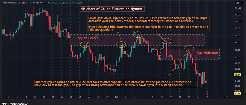
Fig 2.27 - 4H chart of Crude Futures - Price gaps down significantly over the weekend. It then retraces multiple times into the gap as it forms a Reverse H&S pattern but reverses each time encountering resistance. After breaking below the gap zone, another gap up occurs forming a gap zone closely below the initial zone. With both gap zones close to each other, the price encounters strong resistance and declines sharply.

Fig 2.28 - 2H chart of Gold CFDs - Price breaks below a narrow congestion zone to find support at the strong gap zone below. Subsequently, price breaches the gap zone and then retraces to test the zone from below. It is barely able to penetrate the zone before reversing into a steep decline.

Fig 2.29 - 4H chart of Gold Futures - Multiple instances of price reversing after testing the gap zone that offers S/R even weeks later. It helps to draw rectangles to mark significant gap zones, extending them to the right as the price approaches, looking out for a reversal.
Daily
The importance and treatment of gaps on the daily chart does not differ much from intraday as both of them mostly occur after a weekend. However, the gaps on the intraday charts may seem larger or more prominent because of the shorter timeframe.
The examples below have been taken from the indices/spot crude as they are better suited for the purpose of this study. Only those gaps are considered that result in a breakout/ breakdown from a pattern or range, ignoring insignificant gaps.

Fig 2.30 - Daily chart of DJIA index - Breakaway gaps wide enough to be significant create gap zones that offer S/R on any subsequent retest. It is important to select only gaps that break away from a pattern or range and are wide enough. Demarcate these gaps by drawing a rectangle and extending to the right as price approaches to retest, looking for a potential reversal.

Fig 2.31 - Daily chart of Crude Spot - Breakaway gap on the 9th of March, 2026 sets up a wide Gap S/R zone that effectively binds the price for the next 3 months in a sideways range. Any breach of the extremes proves to be false with price retracing after 1-2 days. As the zone is wide enough, trades can be initiated at the extremes on a reversal candle, forming on multiple occasions above.
e) Confluence of Support & Resistance
When studying the charting landscape, always look for a confluence of 2 or more types of S/R. This adds conviction to a trade. The more, the better.
The following example illustrates the principle.

Fig 2.32 - 4H chart of DJIA Futures - Price forms a 1-2-3 bottom pattern and breaks out on 26th of May, 2025, validated by a confluence of multiple S/R that adds strong conviction to the long trade (1) Huge Opening Gap Up on 12 May, 25 that forms a support zone. The low of the pattern penetrates it but retraces to close within the zone (2) Narrow congestion zone that forms over 2 days on 8th and 9th of May, 25. The low of the pattern tests the low of the zone and bounces back (3) Horizontal S/R just above the pattern. The breakout from the pattern closes above the Horizontal, overcoming strong resistance.
Video on all types of Support and Resistance
The following video explains all the 4 types of S/R along with an example of a strong confluence confirming a short trade on a 2H chart of Natural Gas on MCX.
2.4 A Guide To Understanding the Trend in the Higher Time Frame
Correctly identifying the trend in the higher time frame is one of the most important elements of effective trade selection. Trading with the prevailing trend significantly improves the probability of success, while trading against it usually requires greater experience and precision.
As a general guideline:
-
Intraday traders should try to trade in the direction of the daily trend, unless there are clear signs that the trend is about to reverse.
-
Positional or swing traders are better served by aligning their trades with the weekly trend, which represents the broader market direction.
This does not mean that trades cannot be taken against the trend. In fact, some of the strongest market moves occur when a well-established trend reverses unexpectedly, catching a large number of traders on the wrong side of the market. Such situations often arise when a widely observed pattern fails.
However, identifying a reliable trend reversal requires experience and careful observation. When a trend becomes mature, price action often turns choppy and indecisive before the actual reversal takes place.
Therefore, regardless of the type of trade being considered, it is essential to know whether the setup is with the trend or against the trend. This awareness greatly improves trade selection. For example, it would generally be unwise to take an anti-trend trade when a strong trend has just begun or is accelerating.
A. Methods for Determining the Trend
There are several practical ways to determine whether a market is trending or not in the higher time frame. These methods can help identify both existing trends and potential new trends.
1. Visual Inspection
Often the simplest method is to look at the chart itself.
If the price is consistently moving higher or lower over time, the market clearly has direction. Even when the price appears to move within a range, it may still exhibit directional movement from one end of the range to the other, particularly if the range is wide enough.
2. Trendlines and Moving Averages
Drawing a trendline connecting key swing highs or swing lows can help visualize the direction of the trend.
Similarly, moving averages can provide a useful reference. When price consistently stays above a rising moving average, the trend is typically bullish. When it remains below a falling moving average, the trend is usually bearish.
3. Breakouts or breakdowns from Chart Patterns or Ranges
A new trend often begins when price breaks out/ breaks down from a recognizable chart pattern or trading range.
Common examples include breakout/ breakdown from :
-
Head & Shoulders (H&S) or Reverse H&S
-
1-2-3 Top or 1-2-3 Bottom
-
Double Top or Double Bottom
-
Significant consolidation ranges
For a breakout or breakdown to be considered valid, the candle close should clearly confirm the move beyond the pattern boundary.
4. Reversal Patterns Within a Wide Range
When the market is trading within a large sideways range, strong reversal patterns appearing near the extremes of that range can signal the beginning of a new directional move.
For example, a large Bullish Engulfing pattern near the lower boundary of the range may indicate the start of an upward move toward the opposite side of the range.
5. Pattern Failures and False Breakouts
Sometimes a trend begins when a well-known pattern fails.
When traders position themselves expecting a breakdown or breakout and the market moves sharply in the opposite direction, a powerful move can develop due to the “trap effect.”
Examples :
-
A breakdown from a large Head & Shoulders pattern that fails to follow through, moves sideways, forms a smaller bullish pattern, and then breaks upward.
-
A strong intraday breakdown below an important support level that quickly reverses and forms a candle with a long lower wick, such as a hammer.
These situations often lead to strong moves because traders caught on the wrong side are forced to exit their positions.
B. Recognizing Trend Changes
Once a trend has been identified, any significant change in price behavior may require re-evaluating the trend.
For instance, after a prolonged downtrend on the daily chart, the appearance of a large Bullish Engulfing pattern may indicate that the daily trend has turned bullish.
However, it is important to distinguish between different timeframes.
A change in the daily trend does not automatically imply a change in the weekly trend. The weekly trend reflects a much larger structure and should not be altered based on a single day's price action. Daily trends can change relatively quickly, however, weekly trends usually change more gradually and require stronger evidence.
C. Sideways or Range-Bound Markets
Markets do not trend all the time. When price moves sideways within a defined range without clear directional movement, the trend should be considered neutral.
Even after a breakout or breakdown occurs, it is important to watch how the market behaves afterward. If the market fails to move meaningfully in the direction of the breakout within the next two to three candles, the strength of the new trend becomes questionable.
In such situations, it is often safer to reclassify the trend as neutral until clearer direction emerges.
Understanding the broader trend provides valuable context for every trade decision. By recognizing whether the market is trending upward, trending downward, or moving sideways kin the higher time frame, traders can significantly improve the quality of their trade selection and avoid bad trades by taking informed decisions.
Step By Step Approach For Determining Higher Time Frame Trend
Step 1 - Demarcate S/R zones on the charting landscape as covered in the previous section on S/R.
Step 2 - Inspect visually to see if a clear trend is visually discernible.
Step 3 - Annotate all the breakouts/ breakdowns, reversals and failures as mentioned in 3, 4 and 5 of A above with close attention to the S/R levels as demarcated in the first step.
Step 4 - Determine the trending and sideways phases based on Step 3 and use a vertical separator to demarcate with proper annotations.
Note : The changes in real life situations are often determined 1 or 2 days in hindsight once confirmed by subsequent price action to avoid noise (false breakouts/ breakdowns/ reversals/ brief sideways action in a trending phase).
CHART EXAMPLES
Below are chart examples that follow the above steps for determining the daily and weekly trends combining the concepts mentioned in A, B and C above for intraday and positional traders respectively.
-
The first 2 examples are for the daily chart of DJIA Futures and Gold CFDs - for intraday trading
-
The next 2 examples are for the weekly chart of DJIA Futures and Gold CFDs - for positional trading.
Daily charts for intraday trading
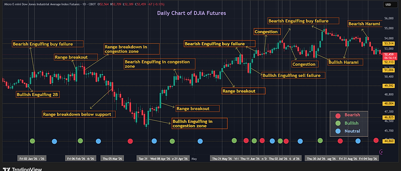
Fig 2.33 - Daily chart of DJIA Futures for ~ 9 months, Jan to mid Sep of 2026, for intraday trading. Trending and sideways phases are determined based on breakouts/ breakdowns, reversals and sideways congestion on the daily chart. The current phase of the market is a critical filter in trade selection.

Fig 2.34 - Daily chart of Gold CFDs for ~ 8 months, mid Jan to mid Sep of 2026, for intraday trading. Trending and sideways phases are determined based on breakouts/ breakdowns, reversals and sideways congestion on the daily chart. The current phase of the market is a critical filter in trade selection.
Weekly charts for positional trading

Fig 2.35 - Weekly chart of DJIA Futures for ~ 3 years 4 months, Mar-23 to Jun-26, showing the trending and sideways phases based on breakouts/ breakdowns, reversals and sideways congestion. The example is similar to the one on daily charts above, but the changes for a given timeframe are much lower in number, suitable for positional trading.

Fig 2.36 - Weekly chart of Gold CFDs for ~ 3 years 4 months, May-23 to Aug-26, showing the trending and sideways phases based on breakouts/ breakdowns, reversals and sideways congestion. The number of trend changes is very small because of the strong uptrend in Gold that started in Mar-24 with brief consolidation periods in between,