
Commodities on the boil - what do the charts say?
- Jan 25
- 1 min read
Given below are some commodity charts that speak for themselves. The timeframe of the chart is spread across monthly, weekly and daily depending on how the patterns can be understood better. Brief annotations below:
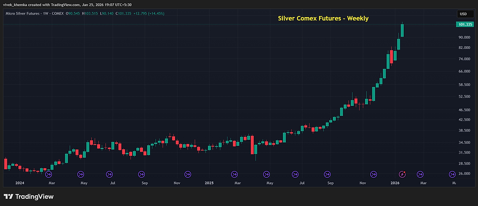
1) Silver (Weekly) - Ballistic runs continues while silver crosses the $100 barrier
2) Gold (Weekly) - Super long green candle after breakout from a bullish pattern

3) Gold/ Silver Ratio (Monthly) - Waterfall continues after trendline break

4) Platinum (Weekly) - Long green candle breakout from a range

5) Crude (Daily) - 1-2-3 Bottom breakout last Friday. Long signal.

6) Nat Gas (Weekly) - Super Long Green candle breakout from a 5 month triple bottom structure

7) Euro USD (Weekly) - Breakout from a 7 month long congestion with a single long green candle opening near the bottom of the range

As you would notice, all the above charts have a common thread - either they are already bullish, or they have a long signal (except for gold/ silver chart that shows the continuing outperformance of silver compared to gold).
Please scroll below to subscribe to our website for regular updates on the global financial and commodity markets.


Comments